ABOUT KOSTEEL
KOSTEEL creates future-oriented values to ensure we thrive together with our customers
CI

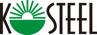
- The company image represents an abbreviation of KOREA STEEL, a steel company that represents Korea. The mission is written in English only, expressing our aspiration to breathe with the world, contribute to human society, and fulfill our role and mission as a global leader in the global steel wire market.
- SYMBOL MARK

-
The lower part of the logo is a comb pattern that vigorously stretches from the blue earth toward the sky and represents the five oceans and the six continents. It symbolizes the core role and future value of KOSTEEL, which is determined to serve at the heart of the global wire rod industry. In addition, the green color of the logo represents a green environment, expressing our identity as an environmentally friendly company.
- kosteel green
rgb_ r0, g144, b61
cmyk_c85, m20, y100, k0
panton_335c - kosteel black
rgb_ r35, g31, b32
cmyk_k100
panton_black c - kosteel sub red
rgb_ r0, g144, 61
cmyk_c85, m20, y100, k0
panton_3516c
- kosteel green
rgb_ r0, g144, b61
- BRAND LOGO
-


